In this article we are going to find 7 tips and tricks on how to make your website design effective, to create an unforgettable first impression on the viewer on the basis of the unique website design examples.
Among the most incredible and unique websites 2016, there are many platforms that are not necessarily related to photography, design or even advertising. Many owners approach their website design processing with sophistication; that’s all. And they’re quite reasonable. Why? You will understand it if you look through the top tips that will help to improve your web or graphic design. Let’s go!
1. Direct the viewer’s attention, using space and visual tricks
There’s a golden rule: you have to put all most important things on a single page. The most important information on any landing page is your call to action. Whether the button “Download now” or “Subscribe” link inviting the visitors to “Learn More” or a distinct call to “Buy Now,” your call to action is the most valuable and important element on the page. Design helps to achieve the ultimate goal of your website and find the needed button faster. And that’s why the biggest mistake you can make is to complicate the process of finding and clicking on the necessary link for your visitors.
For your call to action to look alluring, attractive and a real hook, you can push it to the visitors of your site by using a series of simple visual tricks:
Empty / Free Space:
Using bright button with an elegant design in the heart of the empty space (more precisely, it is some kind of space where the color does not matter) you just give a bit of “freedom” to your call to action and redirect all the attention of visitors to the button, rather than anything else.
Visual tricks: Give your “call to action” any other color which’s different from that palette throughout the rest of the page.
-
Make a “call to action” color blocking: (black on white, yellow to violet, etc.)
-
Let the person / animal on photos / illustration look directly at the “call button.”
-
Make an unusual design or shape.
-
Insert it into any dynamic element.
-
Draw arrows or the track, leading directly to it, etc.
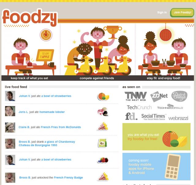
Even at such a dense and busy landing page as Foodzy, a call to action is designed so that it stands out, thanks to the bright button, which is very different from the rest of the color scheme of the page, but harmonize at the same time. Aim to keep the focus by using free space and visual tricks as in many unique websites designs.

2. Play with the user’s curiosity, seduce
People are curious creatures by nature, and you can easily take advantage of this essential feature, to improve the effectiveness of advertising with your design. Use unique websites templates to evoke the curiosity.
A “click-through” landing page by Clearvale was created with the only purpose: to seduce and cause the curiosity of visitors. It is also called a jump page or a beautifully named romance page, the purpose of which is to enhance the interest level of the visitor to a point, where he or she will move to the second base.
And it really happened. Since the billboard is located where the highway doubles, the choice is obvious and you really want to click on “Read more” and find out what’s the point of this whole undertaking even if you do not have any assumptions about what else can be discussed.

3. Add colors
No one wants to live in a black and white world. Of course, a rigorous combination of colors can create a highly successful artistic image when used correctly, but, in most cases, Internet users respond better to the bright, vivid colors and certain shades, rather than the old school and boring black and white range.
Imagine the visitors as children in a candy store. Your landing page should back them up with something sweet, each time they’re on, to chose you among available diversity of the same.
The bright, simple and clear, this landing page immediately goes to the essence in such a catchy and exciting graphic manner.

4. Leave some space for surprises
There are so many channels of information, and strong flows of advertising (radio, television, the Internet, and your mailbox) around us, that we have already developed a mechanism of filtering it all at the subconscious level. Now our brain expects only a certain amount of advertising information, which looks briefly and may be stored in the memory for more or less a long time. To break through this monotonous process, your page should shake the visitors as a flash of lightning can do. It should be the unexpected, interesting and creative.
Pleasant manner with a unique structure, parallax, a bit strange, but pleasant color scheme, unusual choice of content or its presentation, or a combination of multimedia files – there are plenty of options for how you can surprise your visitors.

5. Use the arrows
The truth and an incredibly simple statistics are as follows: the average Internet user wants to find what he seeks, with the minimum mental work effort. And nothing is more useful for the traveler who got lost, than the presence of a cute and clear arrow pointing to what he is looking for. Arrows indicate not only the direction but a hint of the urgency and instantaneous response. With so many positive characteristics you will never be a loser, drawing one or two arrows on the page!
Users may click on arrow without even reading what’s prior.

6. Add some good photos
Have you ever wondered why all the major large corporations are hidden behind the advertising images of happy, smiling families sitting around a dinner or something like that? All that due to the banal truth: the picture may say a thousand words. If you are selling a product that can solve the problem of malware to your visitors, the perfect picture of a smiling man, or a man obsessed with computers, which is extremely passionate about his work will be a great hook.
Here’s good example, not exactly men with computers, but obviously the men happy with their job positions.

7. Stick to beautifully simplistic flow
There is nothing more effective that can cause the visitor to stay on a page, than a beautiful and simplistic appearance. Nobody likes ugly and overloaded websites.
Unpleasant and sharp colors, bad formatting, information overload, pop-ups and too many dynamic elements create chaos, and users want to close this page as soon as possible.
Let your landing page be neat, simple to understand, and focused on one goal. Expose only the necessary elements and general information, do not place too complex design elements and do not combine them purposelessly. Do not feed your visitors with advertising. Never and ever!
One of our favorite examples is Groupon: genial is simple, you know.

As you see, your website can be filled with the top-notch content and a lot of useful information, but if you are not able to attract the attention of visitors to the right button, the level of design and advertising effectiveness on your web page will be equal to zero. Your goal as the web or graphic designer is to make people “fall in love at first sight”!
Use the tips, leave your comments, add unique websites 2016 design below and good luck!

